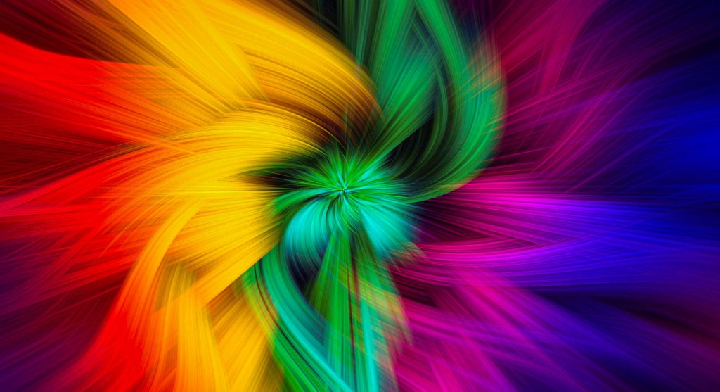
Every June, the world bursts into colour – and not just because some us of may embrace that rare opportunity to wear shorts (delivery workers excluded of course). It’s Pride Month: a time of joy, reflection, visibility and connection. At the heart of it all is the rainbow – not just a vibrant visual, but a powerful symbol of diversity, unity and the beautiful spectrum of human identity.
The magic of the rainbow isn’t only in the way it dazzles – it’s in the stories those colours tell. Each hue has its own journey: through history, language, science, culture and creativity. So in honour of Pride, I thought we’d go on a colourful adventure through time, pigments and meaning.
Grab your favourite shade of tea. Let’s dive in.
Caerulean: Sea, sky…and Bob Ross
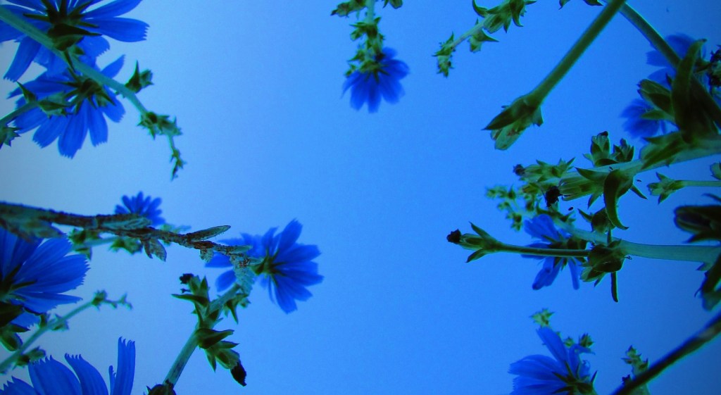
Caerulean (pronounced seh-ROO-lee-un, in case you wish to show off) gets its name from the Latin caeruleus, meaning “sky-coloured” or “heavenly blue.” It first entered the English language in the late 16th century and found its way onto artists’ palettes in the 19th century.
Initially, it was only available as a watercolour, but once it could be mixed into oil paints, it became a go-to for Impressionist masters. Monet loved the colour for capturing the subtle mist of steam trains and foggy mornings, while Van Gogh mixed up his own version to get the exact shade he wanted.
Caerulean represents serenity, depth and the vastness of the unknown. It’s not just a colour, it’s a breath of fresh air in a brushstroke. And yes, Bob Ross would definitely have tucked some happy little trees under this blue.
Fuchsia: Fuchs-ing lovely

Imagine stumbling across a plant so striking, that you name it after a famous botanist. That’s exactly what happened in 1697, when French monk Charles Plumier discovered a flamboyant flower and named it after German herbalist Leonhart Fuchs (say that quickly three times).
The flower itself is flamboyant, hanging like little ballerinas with vivid pink and purple skirts. Nature clearly didn’t believe in subtlety here and I love it.
Fuchsia as a colour is electric – a pink-purple blend that demands to be noticed. It symbolises confidence, fun and a refusal to be muted.
Also: if you haven’t seen the town of Wemding, Germany – aka Fuchsienstadt – you’re missing out on a full-on floral theme party.
Magenta: A true revolution
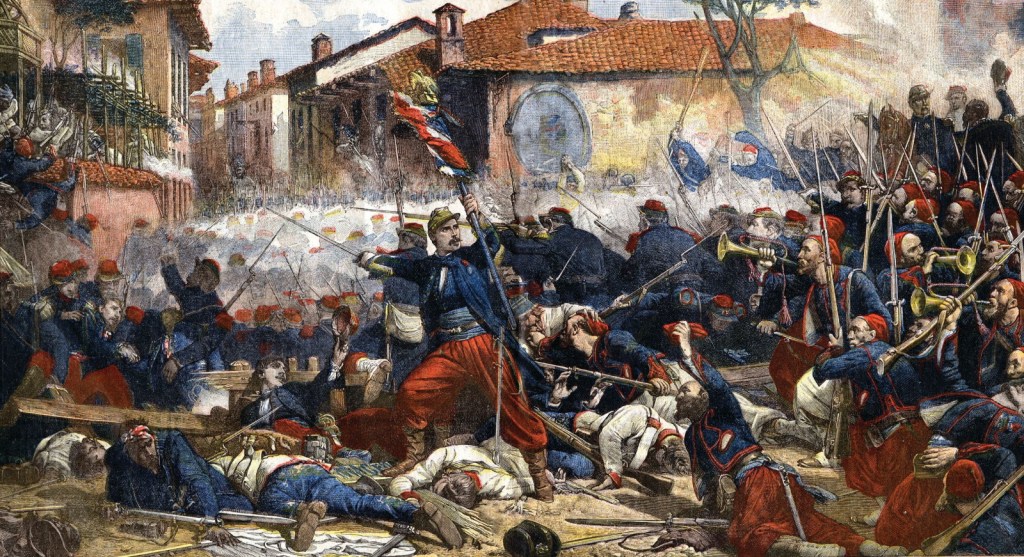
Magenta might sound botanical, but its roots are anything but natural. This dazzling pink-red hue was born out of chemistry labs in the 1850s, developed from aniline dyes derived from coal tar.
It was named in honour of the Battle of Magenta (1859), a bloody but decisive fight in Italy’s unification. Some say the vivid uniforms of the French Zouaves may have inspired the name, adding a touch of style to all the historic grit.
Magenta is bold, synthetic and revolutionary – quite literally. It’s also one of the base colours used in printing (CMYK), meaning it’s been shaping our visual world for over a century. A perfect reminder that sometimes the most brilliant shades come from the most unexpected origins.
Alabaster: Elegance carved in stone (including cat statues)
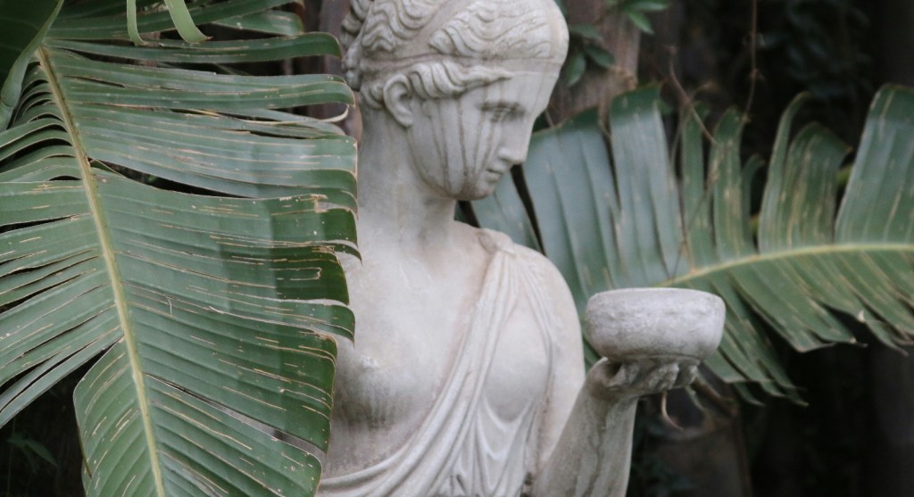
Alabaster isn’t just a colour – it’s a material, too. This smooth, creamy white stone has been carved into statues, perfume bottles and temple ornaments since ancient times. Its name may trace back to Bastet, the Egyptian cat goddess, whose vessels were made from the stone.
Used across ancient Egypt, Greece and the Middle East, alabaster was the marble of choice for those who wanted light to glow gently through their sculpture.
In modern use, alabaster as a colour refers to an almost-luminous soft white – serene, pure and timeless. It’s the quiet artist of the colour world. If it were at a party, it would be the one holding a glass of white wine, giving you life advice you didn’t know you needed.
Orange: Fruit, colour and a bit of linguistic chaos

The colour orange didn’t have a name in English until after the fruit arrived in Europe. Until then? It was just called “yellow-red.” The word made its way from Persian (nārang) to Arabic (nāranj) to Old French (orenge), finally becoming orange in Middle English.
The first recorded use of “orange” as a colour name in English was in 1502, in a description of clothing purchased for Margaret Tudor – this is contested, but at least a fun (and regal!) explanation of the word being transferred.
Orange evokes energy, heat, healing and light – a shade of joy and action. Whether in a Pride flag or a bowl of mandarins, it brings vitality to everything it touches.
Amber: Fossils, fragrance and Jurassic Park
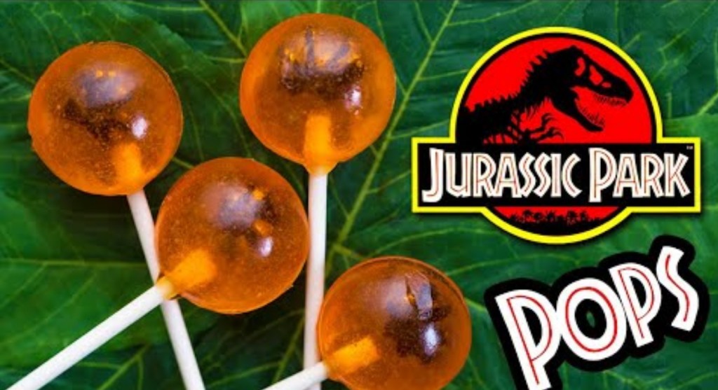
Amber began life as tree resin, took a few million years off, and came back fossilised and fabulous. Before it became ingrained in our minds as the final resting place of prehistoric mosquitoes (thank you Jurassic Park – we really didn’t need the lollies), “amber” originally referred to a completely different substance. Ambergris, is a a waxy substance produced by whales used in high-end perfumes. I do not recommend Googling that.
As a colour, amber is honeyed, radiant and filled with nostalgia. It’s the golden hour of the palette, being soft, rich and a little mysterious.
Umber: Earthy, moody and masterful

Umber is one of the oldest pigments known to humankind, showing up in prehistoric cave paintings and Renaissance portraits alike. Made from iron and manganese oxides, it ranges from warm brown to a greenish-dark tone.
Its name might come from Umbria, a region in Italy, or from the Latin umbra meaning “shadow.” Either way, it became essential in creating depth, skin tones and atmospheric backgrounds in classical art.
Despite being dismissed by some 17th-century painters as “greasy,” Leonardo da Vinci used it extensively in his subject’s hair and clothing in the Mona Lisa. If it’s good enough for him, who are we to argue?
Viridian: Cool, calm and collected

Viridian is a blue-leaning green pigment, named after the Latin viridis, meaning “green” or “fresh.” It was first created in 1838 and became popular for its cool, calm and non-toxic alternative to earlier green pigments, which were beautiful but occasionally deadly (arsenic, anyone?)
It gained fame in the 19th century and was embraced by artists like J.M.W. Turner, who loved its serene, natural tones. Viridian represents growth, rebirth, and balance. It’s the colour of lush forests, peaceful minds and that one calming yoga instructor we all secretly wish we could be.
Persimmon: The forecasting fruit
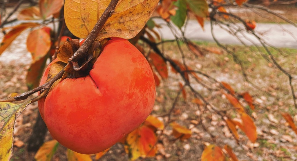
Persimmons are native to China, Japan and North America and while they’re delicious, they’re also practical. American folklore holds that you can predict winter weather by slicing open a persimmon seed and reading the shape inside:
Fork = mild winter
Spoon = heavy snow
Knife = bitterly cold
Beyond its weather predicting and culinary appeal, persimmon has cultural and mythological significance. In Homer’s Odyssey, the fruit of the lotus – believed by some to be persimmon – causes forgetfulness and peace.
As a colour, persimmon is a vibrant orange-red, embodying the shift from sunlit autumn to the hush of winter.
Scarlet: Passion, power and a bit of drama
Scarlet has always been the colour of status, sacrifice and drama. In ancient times, it was made using kermes insects – tiny red creatures found in oak forests that produced one of the most intense and expensive dyes in the world. Think Roman generals, religious leaders and literary characters who really should have known better.
The word itself comes from the Persian saqerlât, passed through Latin and Old French before settling into Middle English. An early recorded use of scarlet in the English language dates to 1250.
Scarlet is a colour that doesn’t just say something – it declares it.
A celebration of colour
Colours are more than visual delights – they are stories. They carry meaning, culture, memory and magic. Each shade tells us something about our world and ourselves – together, they create a spectrum as rich, layered and human as the Pride flag itself.
As we celebrate Pride Month, let’s honour every hue – from the quiet glow of alabaster to the bold brilliance of scarlet. Because being yourself, in full colour, is always worth celebrating.
What’s your favourite colour and why? Drop your story in the comments – let’s make this month even more vibrant.
Wishing you a joyful, brave and brilliant Pride. In full colour.

Leave a comment